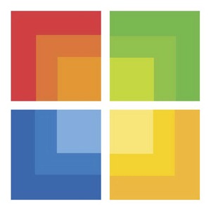
More details are emerging about the Microsoft Stores, the much hyped retail stores from Microsoft to compete with Apple Stores. Few weeks ago we heard about the leaked building plans of the stores and now a well know Microsoft blogger unearthed the logo of Microsoft Stores from the Trademark Registration documents.

Microsoft filed the registration of this logo on 2009-07-28 and United States Patent and Trademark Office yet to approve. The patent document describes the logo as
The mark consists of four squares arranged in a rectangular grid. Each square is colored to form three square-shaped regions within the square, with the color of each region gradating from dark to light toward the center of the design. The upper left square design is red, the lower left square is blue, the upper right square is green and the lower right square is yellow. The squares are separated by blank space.
The Microsoft Stores logo colors and shape are closely matched with the famous Microsoft Windows logo colors. Here is the Windows logo for you to compare with Stores logo

The Microsoft Store logo design is not stunningly good or at the same time it neither bad. I give 6/10 for the design. What do you say?

Thanx for the information about new logo..
Are they going to change their windows 7 logo to this new logo ?