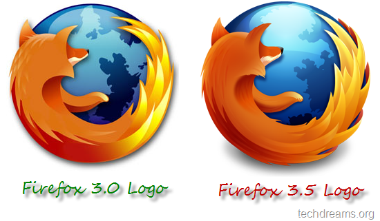
Mozilla developers are gearing up for the release of next version of world’s most powerful and favorite browser: Firefox 3.5. The Release Candidate of Firefox 3.5 is expected to be available in few days time, meanwhile Mozilla released the new logo of version 3.5.
Here is the comparison of Firefox’s new and old logo

As you see in the above image, we cant find much changes at the first glance. The new icons has more depth, brightness on certain parts and the changes are very minute: brightness on the top portion of the globe, the color & edges of fur, change of shadows on the globe next to the right hand of fox, tail color etc .
Changes to the icon are welcomed positively by majority of the Firefox users, but few of them, especially Vista users are complaining that 16×16 icon looks very bad. A comment on the Mozilla blog reads:
The new icon looks really nice, except for the 16 x 16 icon. I don’t like the dark outline of the fox in the centre, it eats away almost all of the globe, and looks ugly.
Another comment reads
it looks great in the larger, high-resolution versions, but in the sizes that will actually be seen 99% of the time as the icons on user’s computers, it looks terrible. It looks over-saturated and blown (highlights that is). I think there needs to be some serious thought put into adjusting the smaller versions for contrast and saturation.
We have to wait and see on how Mozilla is going to react to these comments.
The new icons are available in various sizes, starting from 16 x 16 to 512 x 512, and in various formats of Windows, Mac and Linux. You can download all the icons from here and here.

Achei que eu era o único incomodado com este ícone novo.
Está horrível
Firefox, my favorite browser, i can’t browse in any other browser.