How often we see Google modifying it’s search home page? Not so often till Google+ is introduced. After introduction of Google+, Google is trying hard to knit all non-search products and upselling them on most website google.com .
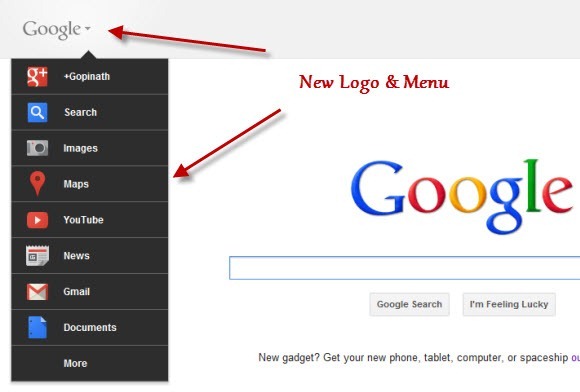
Today Google Search home screen sports a fresh look with a new a new logo, on the face display of non-search products and other small layout changes.

In the new design, a new grey Google is logo displayed on the top left corner and it very looks different compared to the traditional colour full Google logo.
The horizontal black bar that use to run across the browser on top of the screen is replaced with a pull down floating menu on the left side of home screen. The new navigation bar is opened up automatically when we visit the search home page and I found it little annoying to have a wide menu bar open on the screen. When you click on any part of the home screen the menu is hidden and it can be accessed by hovering mouse on top left corner Google icon.
Apart from these changes the homepage remains more or less the same with the signature Google bar prominently displayed in the middle.
The modifications are slowly rolled out the users and with preference to Google Chrome users. As I write this post, I’m able to access the new home page design on Google Chrome browser alone. IE & Firefox are still showing the old design.
